Danti
Defense
AI-driven, natural language geospatial search
AI-driven, natural language geospatial search
As UX Design Director at Danti, I led a cross-functional team of 8+ engineers and 2 designers to create an AI-powered geospatial analyst assistant, addressing a critical $3M+ annual waste problem in government procurement. Working directly with US Space Force operations teams and C-level executives, I designed the complete user experience for a unified search platform that integrates government-owned imagery (GEGD) with commercial satellite providers, enabling agencies like the NGA, FEMA, and Space Force to eliminate duplicate imagery purchases. Over six months, I shaped product strategy through competitive analysis, mentored UX designers, and established scalable design systems while navigating the complexities of secure, mission-critical government software—resulting in a breakthrough platform that demonstrates how strategic UX leadership directly impacts operational efficiency and fiscal responsibility.
In 2023, the NGA presented the “gSEARCH Challenge” to find solutions for searching geospatial content in government and commercial repositories. Danti won the challenge and funding to build a prototype.

Government agencies (NGA, FEMA, US Space Force) operate in silos when purchasing satellite imagery, frequently buying duplicate coverage of the same geographic areas without knowing other agencies already own the imagery they need.
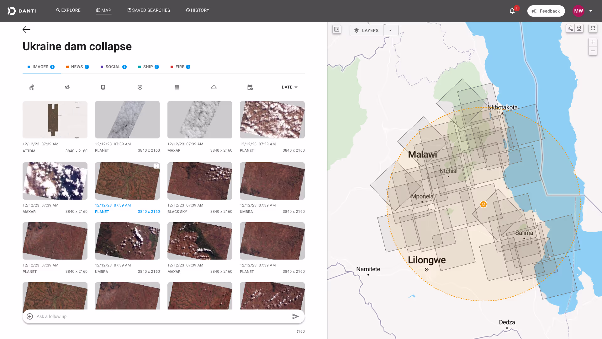
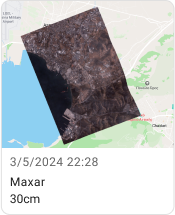
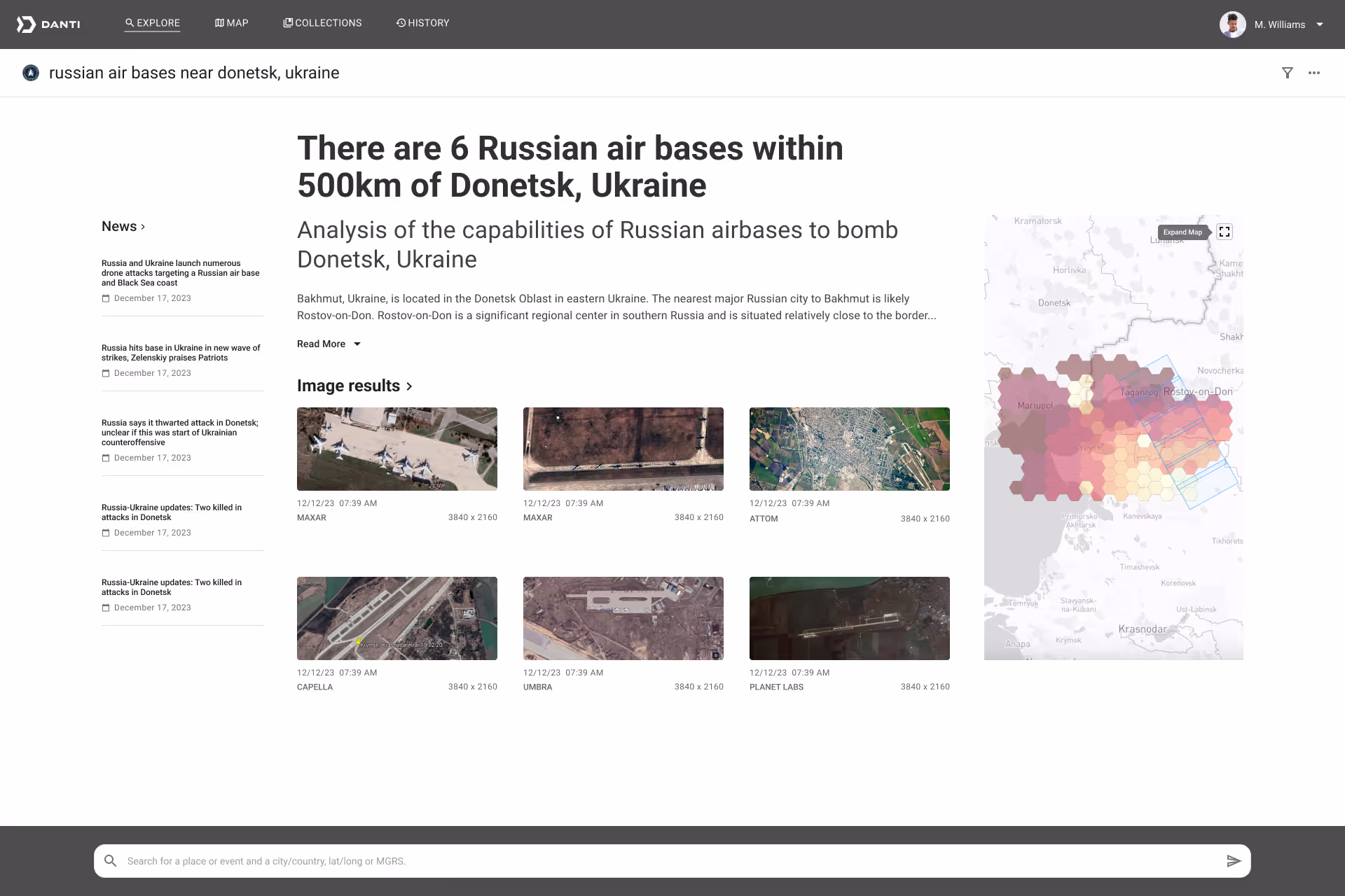
Danti integrates government-owned imagery (via GEGD) with commercial satellite providers (Maxar, BlackSky, Planet) to show agencies what imagery already exists before they make new purchases. Additionally, users can ask natural language questions to gain 360º context about any location on earth.

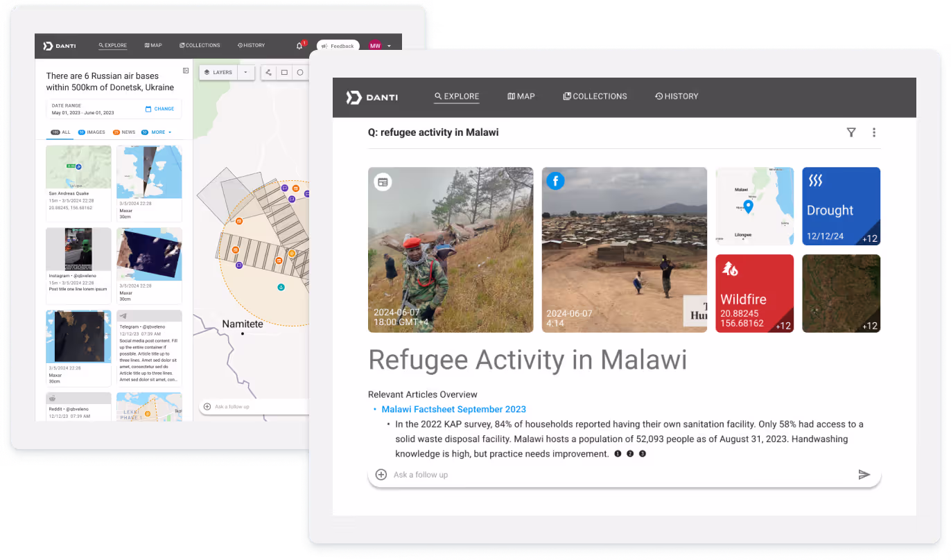
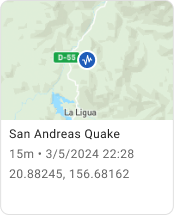
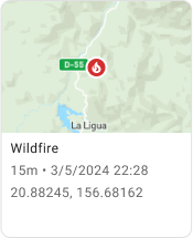
Danti searches a number of data sources and returns relevant results. For example, if the user entered “Tank movement in Donetsk, Ukraine,” Danti would return images of that city with a high probability of tanks. When social media, news and analytics mention tanks in Ukraine, Danti extracts the location and returns the whole bundle as a result.
Danti's integration with GEGD and commercial satellite providers eliminates systemic inefficiencies in government imagery procurement. UX Design plays a key role. If the platform isn't intuitive, easy to use and understand, the efficiencies won't be realized. Consider the following scenario:
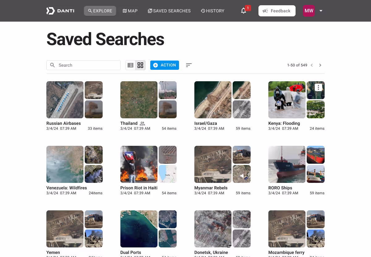
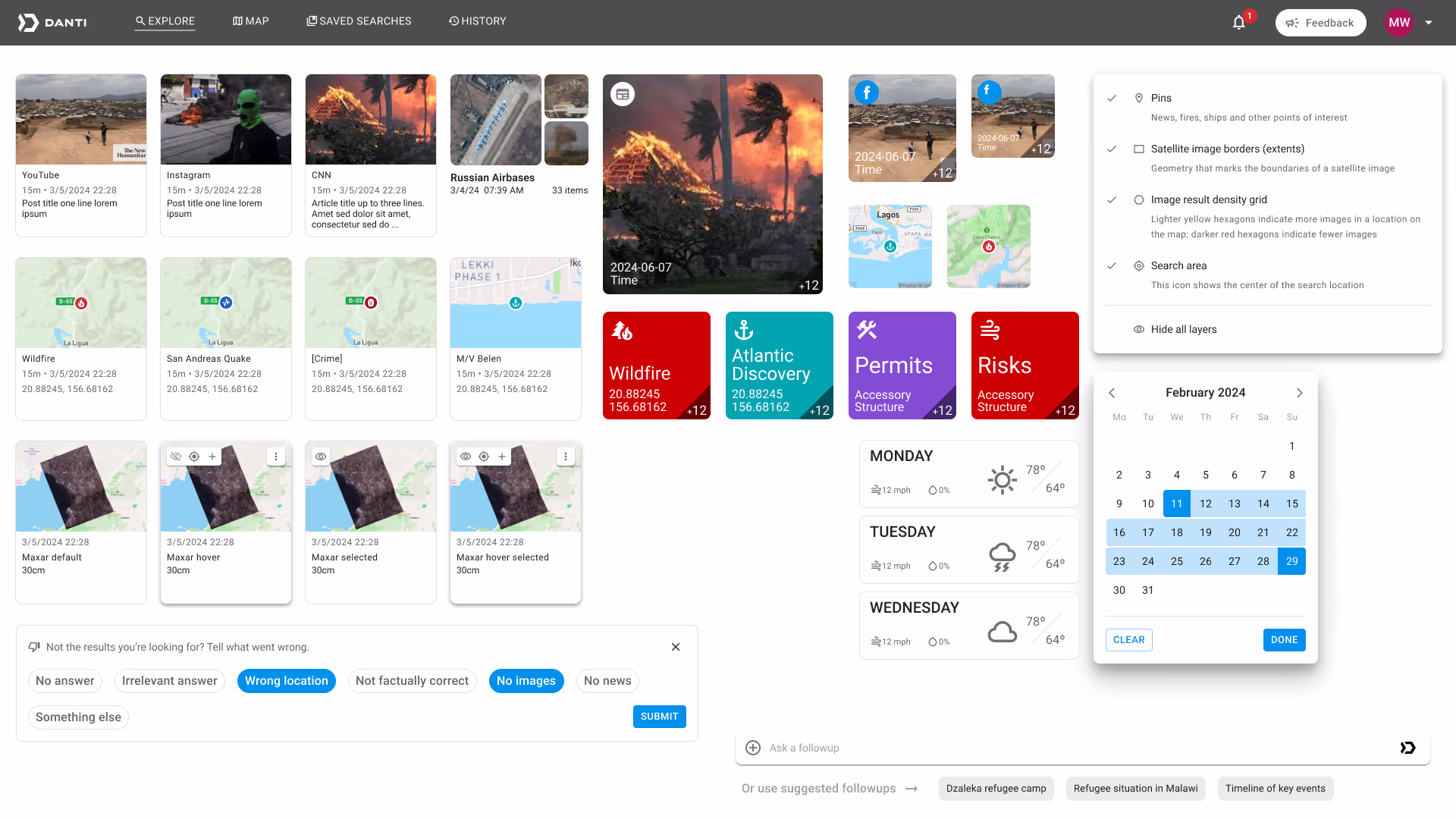
A collection is a folder for users to store, sort and share search results. Additionally, users and vendors exchange images through collections. These images are typically sent to computer vision models for object detection.
Geospatial applications obviously need maps, but Danti wanted to differentiate its product. The CEO wanted it to be an AI search tool, not another map interface. As a result, I had to avoid using too many UX patterns from satellite imagery products.
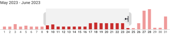
Histograms effectively visualize data distribution over time, making them ideal for our search results. They serve two key purposes:
This visualization allows users to easily identify dates with high result volumes, potentially indicating significant events worth investigating.
Because Danti search results were largely visual, I made the decision to use cards as the UI component. This made the search results scannable, consistent and visually appealing. Each card needed a lot of interaction, so having them as a container helped keep things organized and distinct.


The first phase of gSEARCH was about proving that Danti could retrieve images through natural language search. The goal of the second phase was to show that Danti could provide context as well.
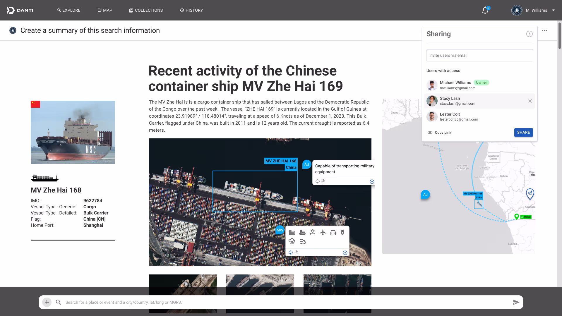
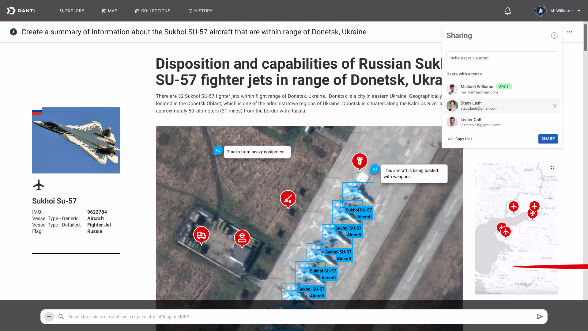
Multimodal search results show information from various data types in one search. Initially, Danti displayed each data type on separate pages. For the next version, Danti aimed to present multimodal results on a single page. This approach would help users gain better context by seeing different data types side by side.
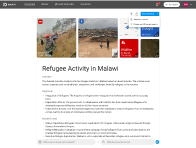
To illustrate multimodal search results, I made two different user scenarios. The first, for our government analyst users, showed how Danti could help track a Chinese cargo ship delivering materials to an African port. The second showed detecting military aircraft on the ground.
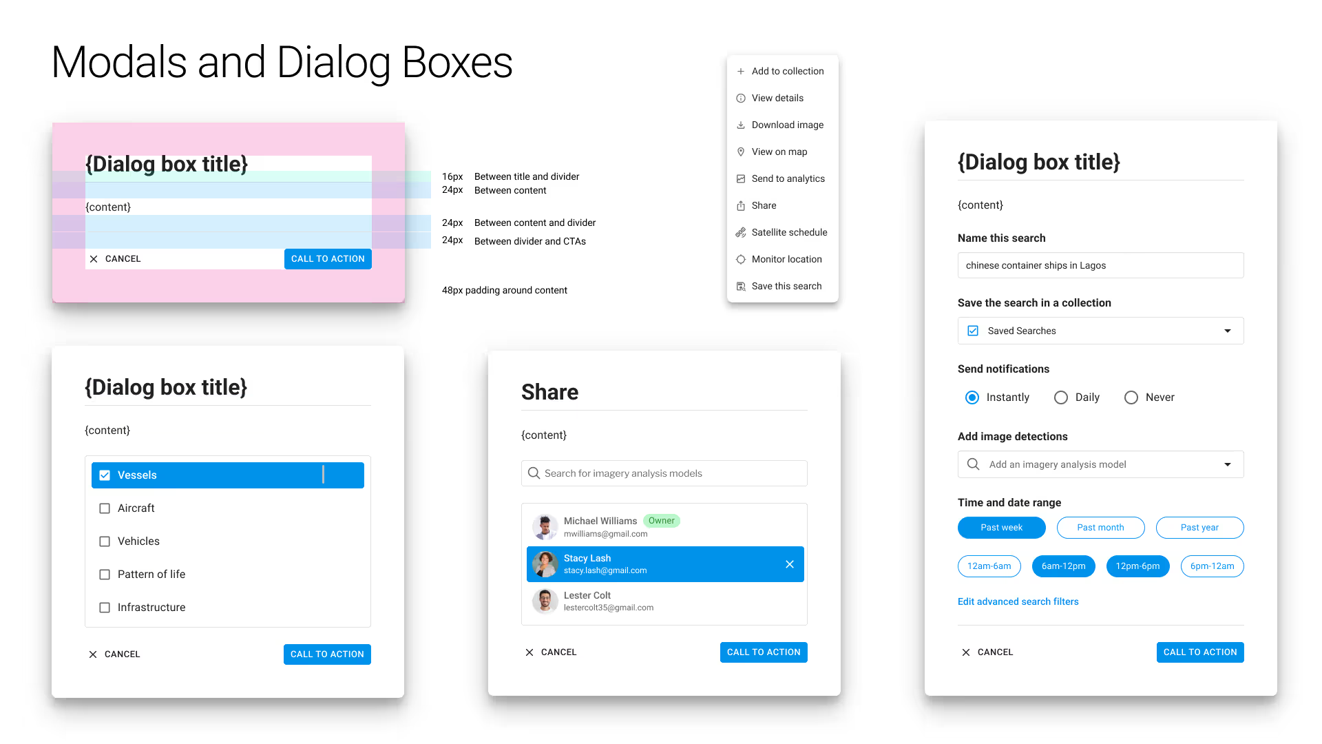
I established a comprehensive component library using the Mantine component library as our foundation, then extended it with custom components. This strategic decision enabled rapid feature development while maintaining design quality—crucial for startup speed.
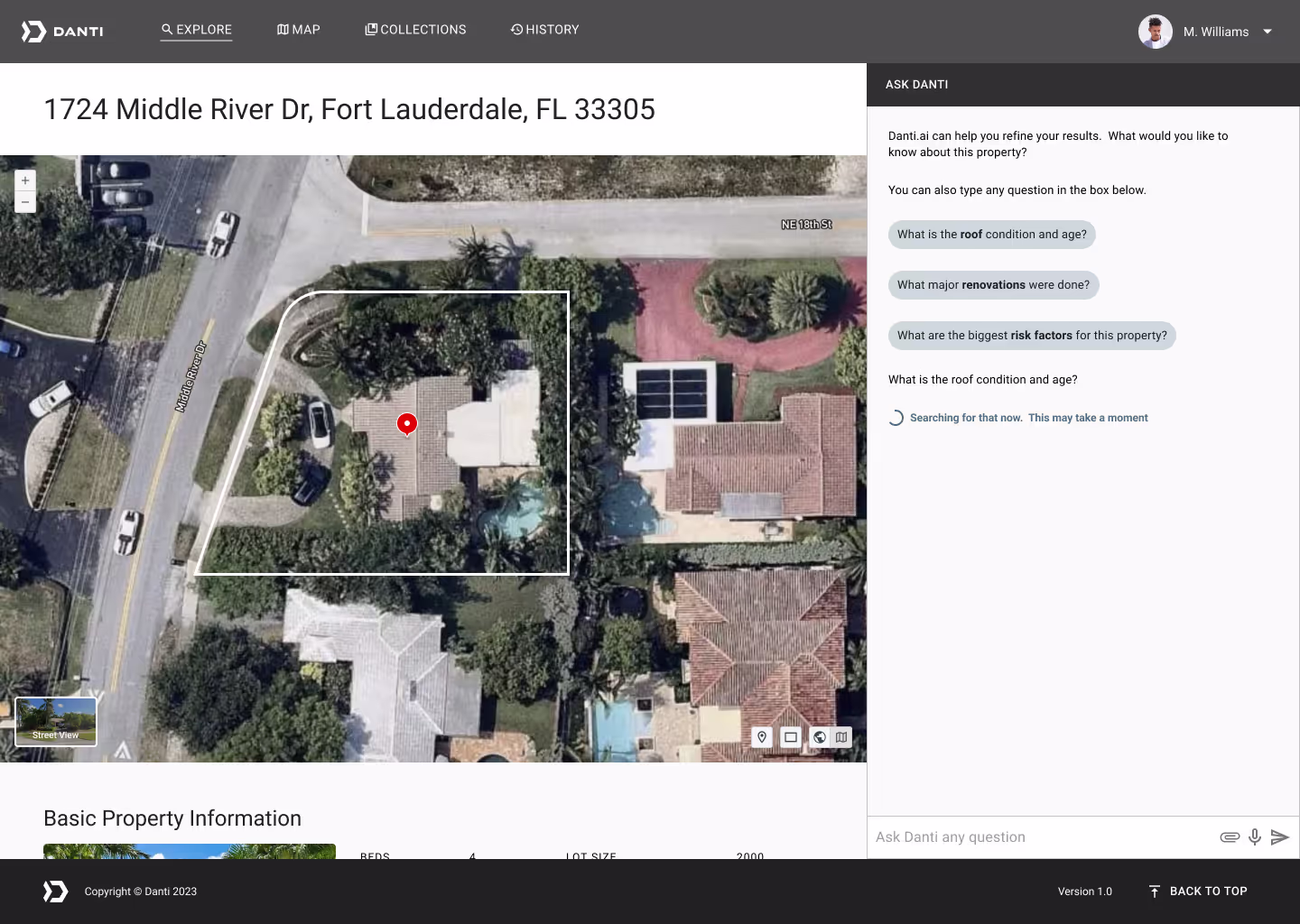
The CEO of the company intended for Danti to cross industries. The next target was a commercial product aimed at real estate agents, insurance underwriters and claims adjusters. To illustrate this use case and to help our sales team determine desirability, I created a scenario showing how Danti could help determine damage on a roof after a weather event.
Danti workflows all end when the user gathers data and saves it to a collection. With each release of Danti, the collections feature became more robust. In this iteration, I designed a feature that would allow users to monitor a location and receive updates when new results came in.
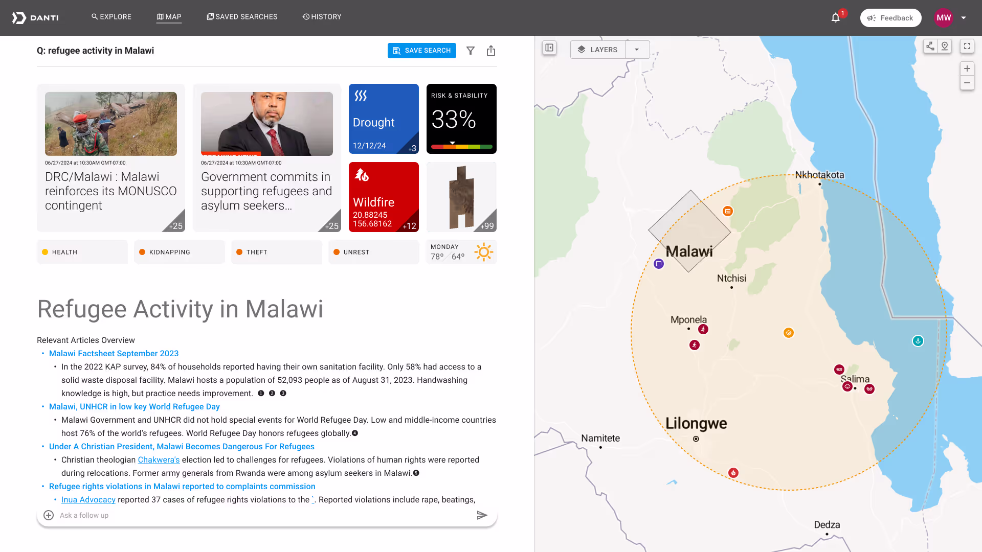
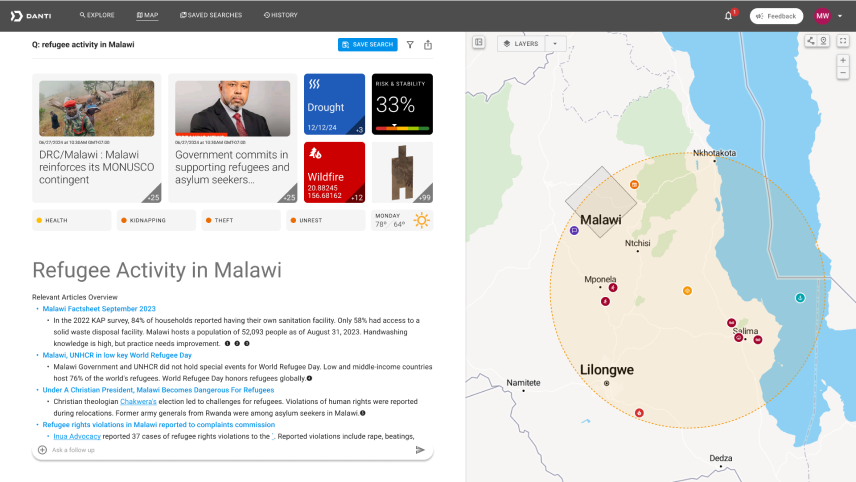
As Danti evolved, the design principle emerged that we wanted to give users a 360 degree view of a search result. Danti needed to give a summary that painted a picture for the user. Something they could easily understand and decide where to investigate further
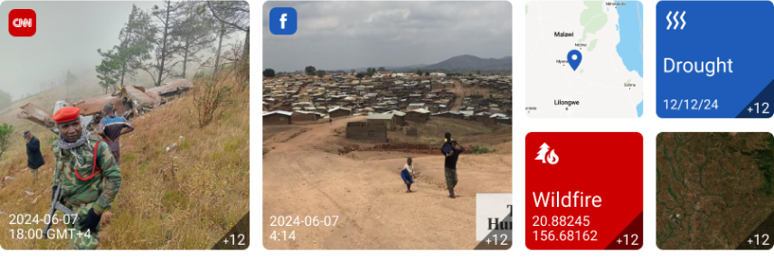
After researching potential patterns and brainstorming with colleagues, I suggested the Bento Box style layout. It’s a popular, modern layout which compartmentalizes information in the same way that the Japanese serving style compartmentalizes food. It’s aesthetically pleasing, highly organized, encourages engagement and creates simple choices for the user.
I made a prototype to show how the interactions for the Bento Box style could play out in a chat style interface.
During ideation on the Bento Box, I knew that I wanted a question and answer style chat interface for Danti. I looked closely at Perplexity, ChatGPT, Microsoft Copilot and a prototype video for Google Gemeni. Each showed how a user could successively query a topic, going deeper until they got into details. This was exactly the need that our users at the US Space Force described. They needed a contextual answer just to understand the location or event they were researching. Once they got to “know what they didn’t know,” they would investigate locations and search results further that interested them. The chat interface could do this. I described this as a “threaded conversation.’
Threading is the current direction for Danti, but it presents many challenges. Because Danti is multi-modal, users might choose to investigate many avenues or data types and still need to return to the Bento Box or AI summary for other paths. This creates an awkward up and down scrolling interaction if all views remain in a single, vertical, scrollable thread.
Because of this, and the feedback I got from my team, I decided to keep detail, map and category pages in the experience. Clicking into an article or image will take a user to another page view.
One change was to keep the map persistent. The chat remains available to the user while the map responds on the right. This way both the semantic and the lexical search results coexist, further giving a holistic picture of the search query.
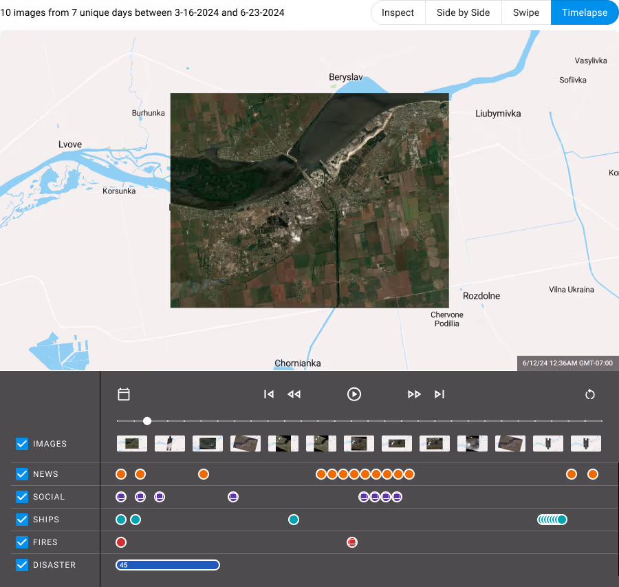
Detecting change over time was an important user need. To help this, I designed concepts for an interface that would allow the user to compare two images or create a timelapse view of several images. My engineering colleagues used my wireframes to create rapid prototypes. This style of gray box wireframing enabled them to get to code faster than waiting for high fidelity designs.
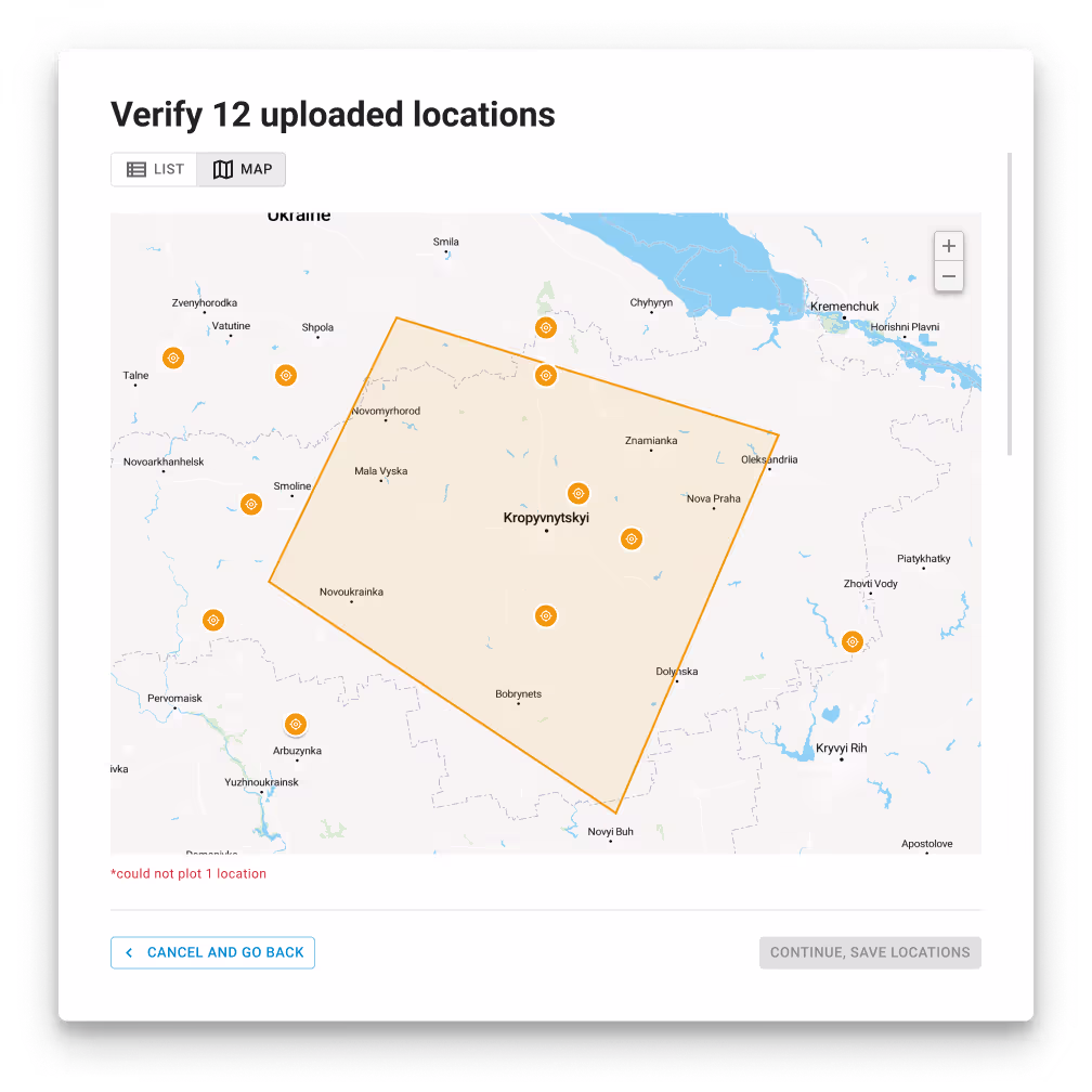
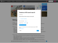
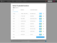
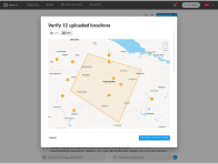
Users also expressed the need to monitor multiple locations for search queries at the same time. To do this, the head of backend engineering suggested a way to upload a .csv of latitude/longitude pairs. I designed a user flow to upload the file, confirm the locations and attach it to a search query with advanced filters.
Danti continues to iterate on the product with the US Space Force. It is scheduled for a beta release in Q4 2024.